The Painted Canvas: Decoding Artistic Styles in Vintage Lunchbox Design

What stories do vintage lunchboxes tell through their artwork?
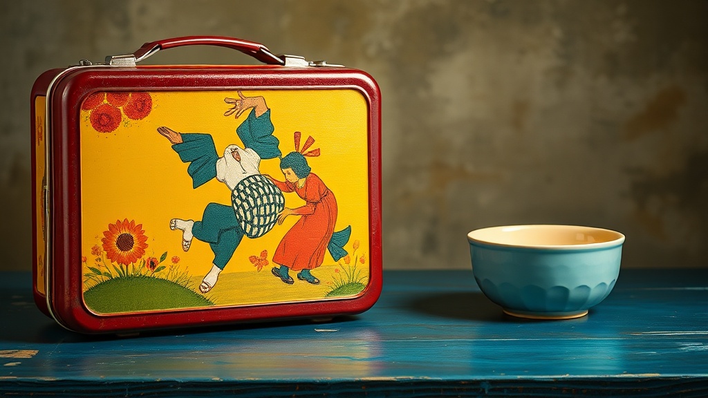
Have you ever paused to truly look at the artwork on a vintage lunchbox, beyond just recognizing the characters or logos? It's easy to see these cherished collectibles as mere containers for childhood lunches, but doing so overlooks the rich artistic and design history they represent. This guide will explore the often-underappreciated art within vintage lunchboxes, helping you understand the stylistic choices, production methods, and cultural influences that shaped these miniature canvases. Recognizing these elements can deepen your appreciation for each piece, transforming your collection into a curated gallery of functional art.
From the mid-20th century heyday to the plastic revolution, lunchboxes served as vibrant, portable billboards for popular culture, reflecting everything from comic book heroes and television shows to aspirational themes of space exploration and Americana. The artwork on these tins wasn't simply slapped on; it was often a carefully considered design — a product of commercial artistry and manufacturing innovation. Understanding these artistic nuances helps us better date, value, and indeed, appreciate the ingenuity of these everyday objects.
What artistic movements influenced vintage lunchbox designs?
The visual language of vintage lunchboxes didn't exist in a vacuum; it drew heavily from prevailing art movements and commercial illustration trends of their respective eras. Take, for instance, the boxes of the 1950s and early 60s. Many of these reflect the optimism and clean lines of Mid-Century Modern design, even when depicting whimsical scenes. You'll often see simplified forms, bold color palettes, and dynamic compositions that were characteristic of advertising and graphic design of the period. Think of the early Walt Disney lunchboxes or those celebrating scientific advancement – they often feature a streamlined aesthetic, hinting at a future-forward outlook.
As the decades progressed, so did the artistic influences. The vibrant, often psychedelic colors and curvilinear forms of the late 60s and early 70s found their way onto lunchboxes, mirroring the broader counter-culture movement. Character designs became more stylized, and backgrounds grew increasingly elaborate, reflecting the rise of complex animation styles and comic book art. The lithography — the printing process that applied these images to metal — became incredibly sophisticated, allowing for astonishing detail and rich, saturated colors that make these pieces so appealing today. This era was truly the 'golden age' of lunchbox artistry, where manufacturers like Aladdin and King-Seeley Thermos pushed the boundaries of what these utilitarian objects could convey visually. For a deeper dive into this evolution, the